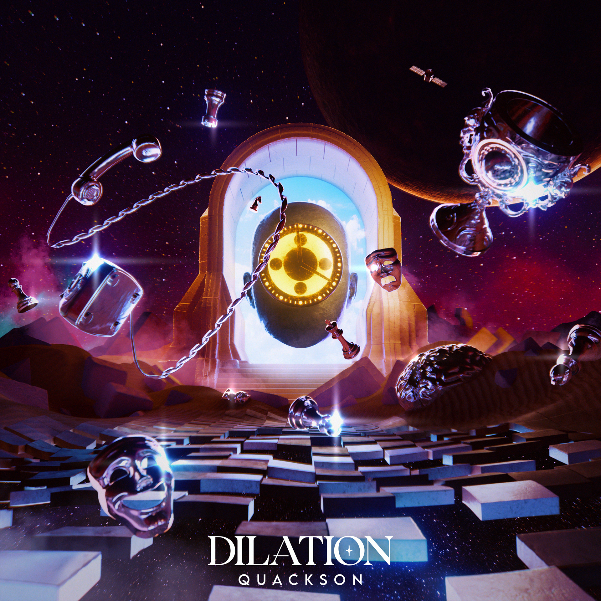
Final Cover Art
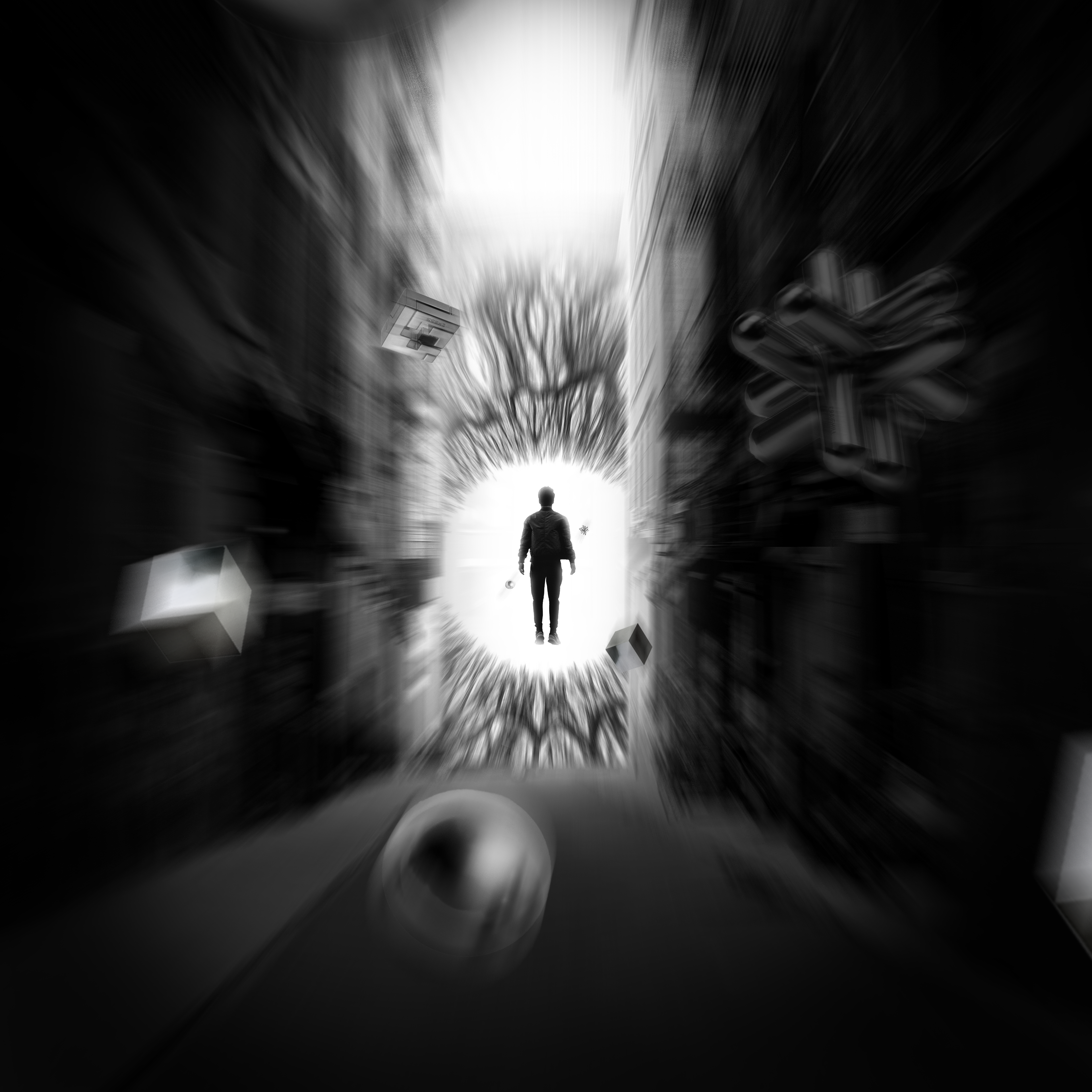
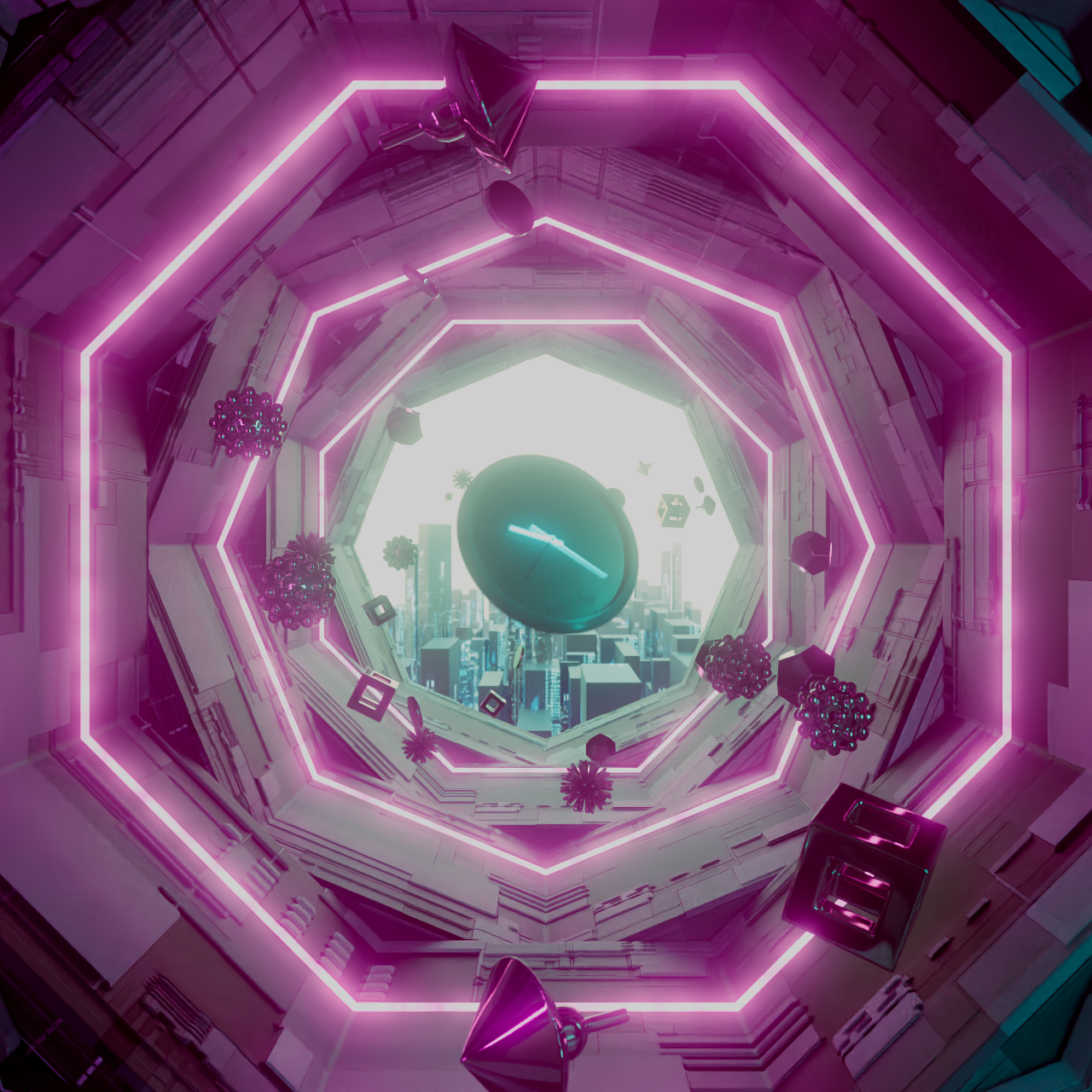
To define the visual direction for Dilation, I developed three distinct approaches, creating a potential cover design for each. These early concepts helped shape the overall tone of the project and gave us space to experiment with different visual languages. In the end, we combined elements from the second and third directions—blending the sleek, cyberpunk-inspired energy of one with the surreal, mystical desert atmosphere of the other. This fusion became the foundation for the EP’s final visual identity.
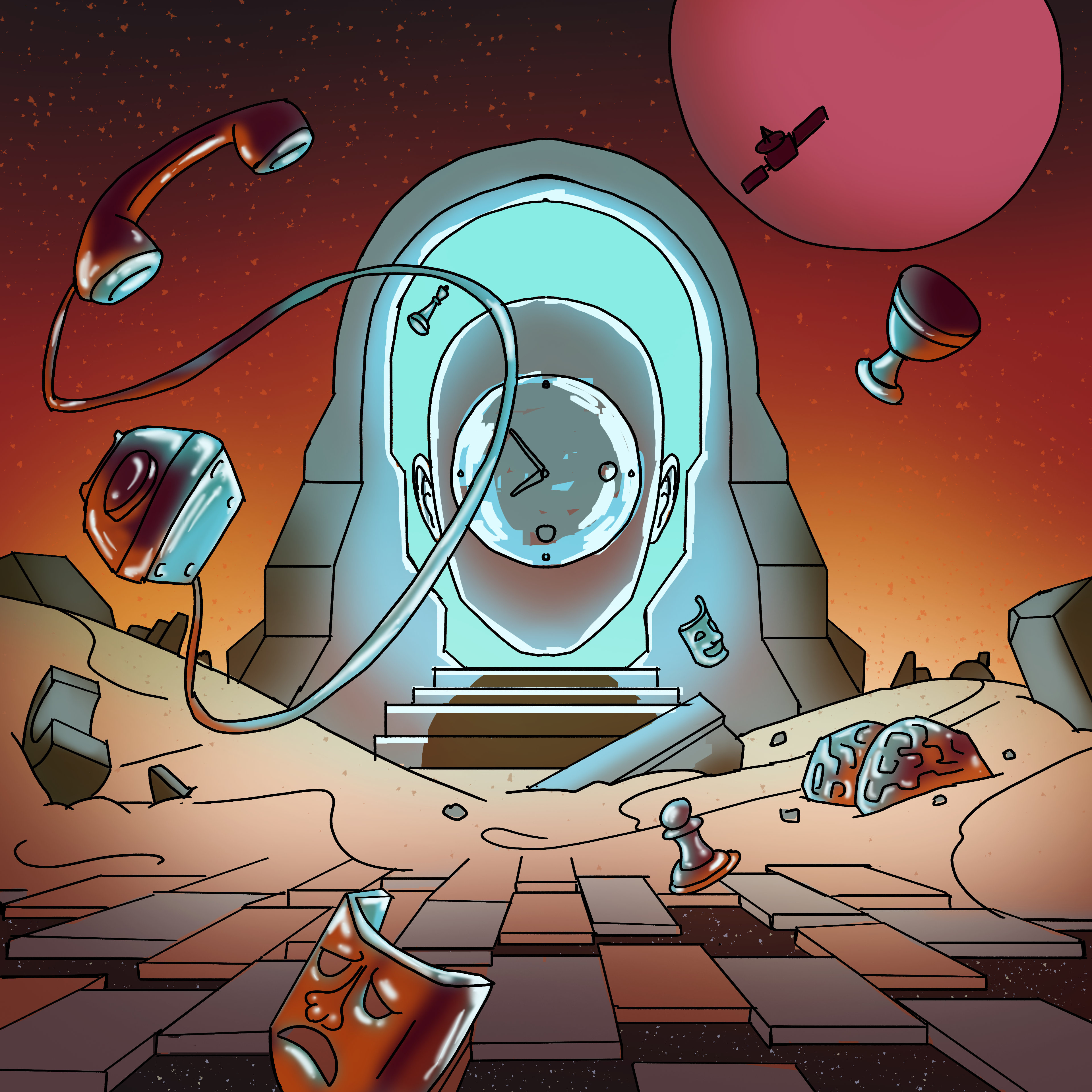
A look at the visual development process, from early sketches through color exploration to initial renders.
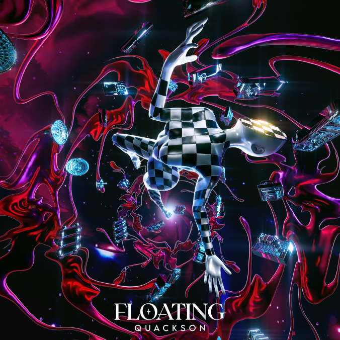
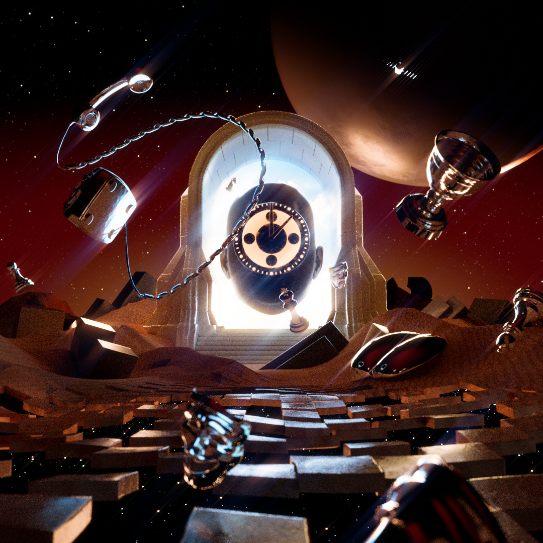
Single Cover Art designed by Lindon Schaab
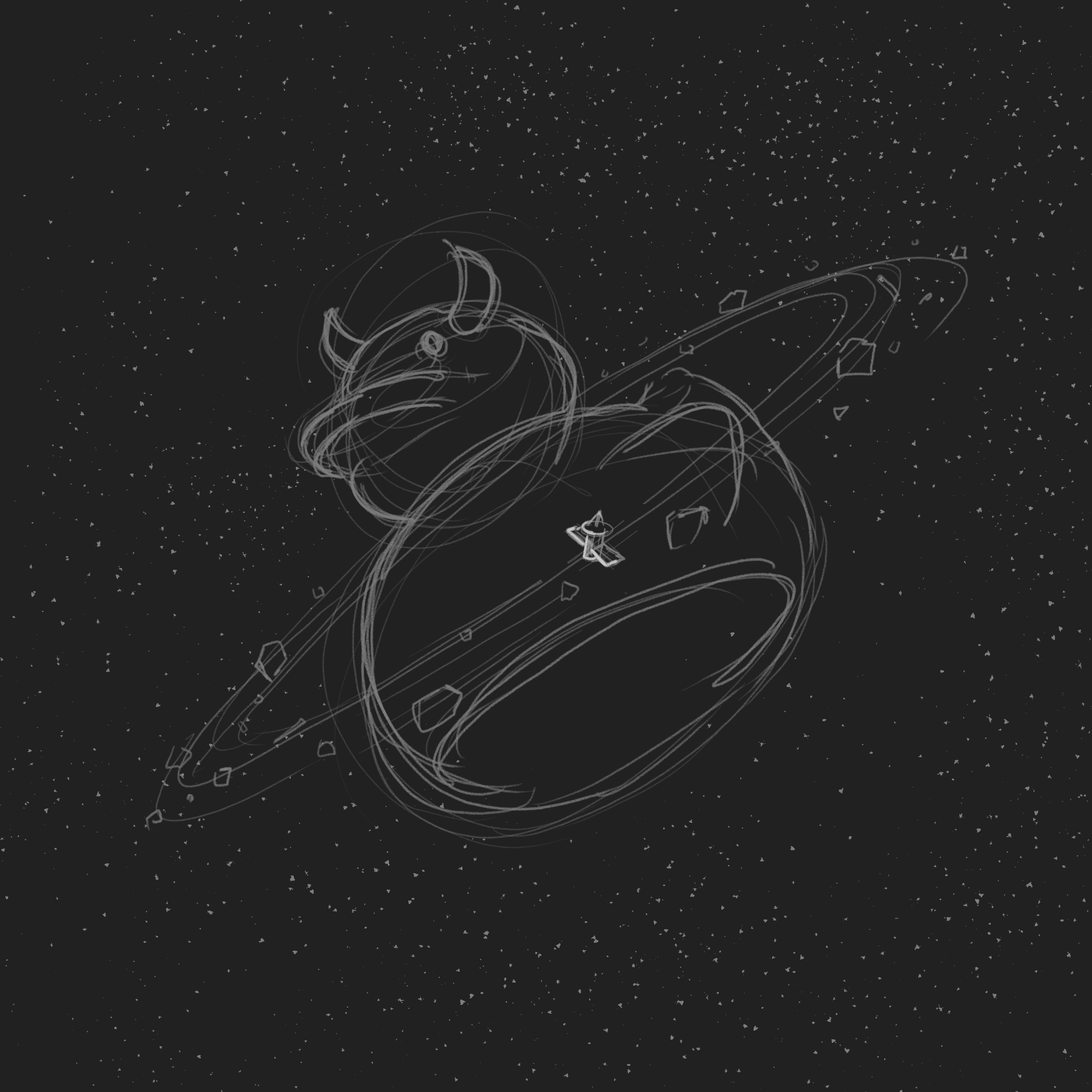
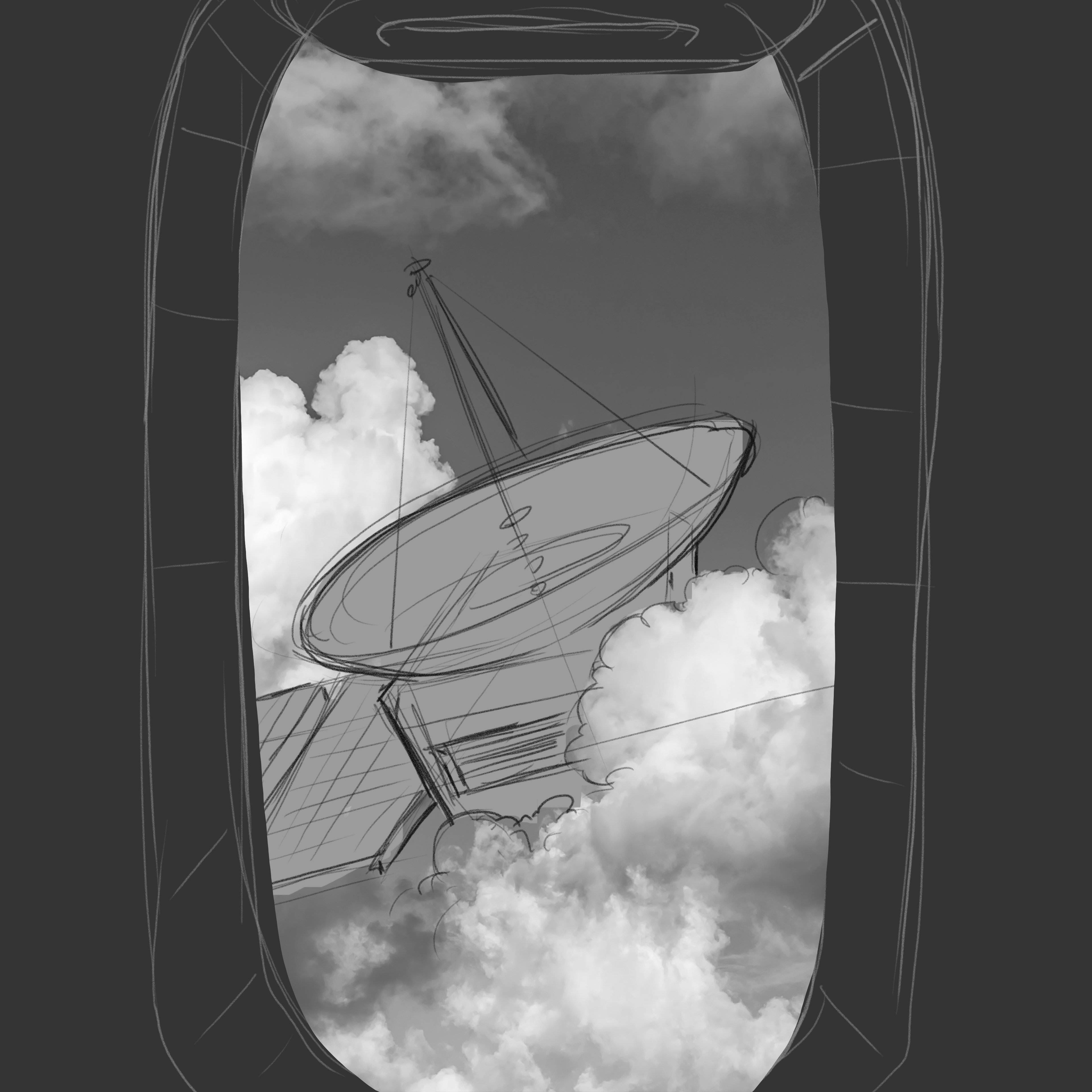
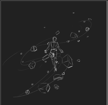
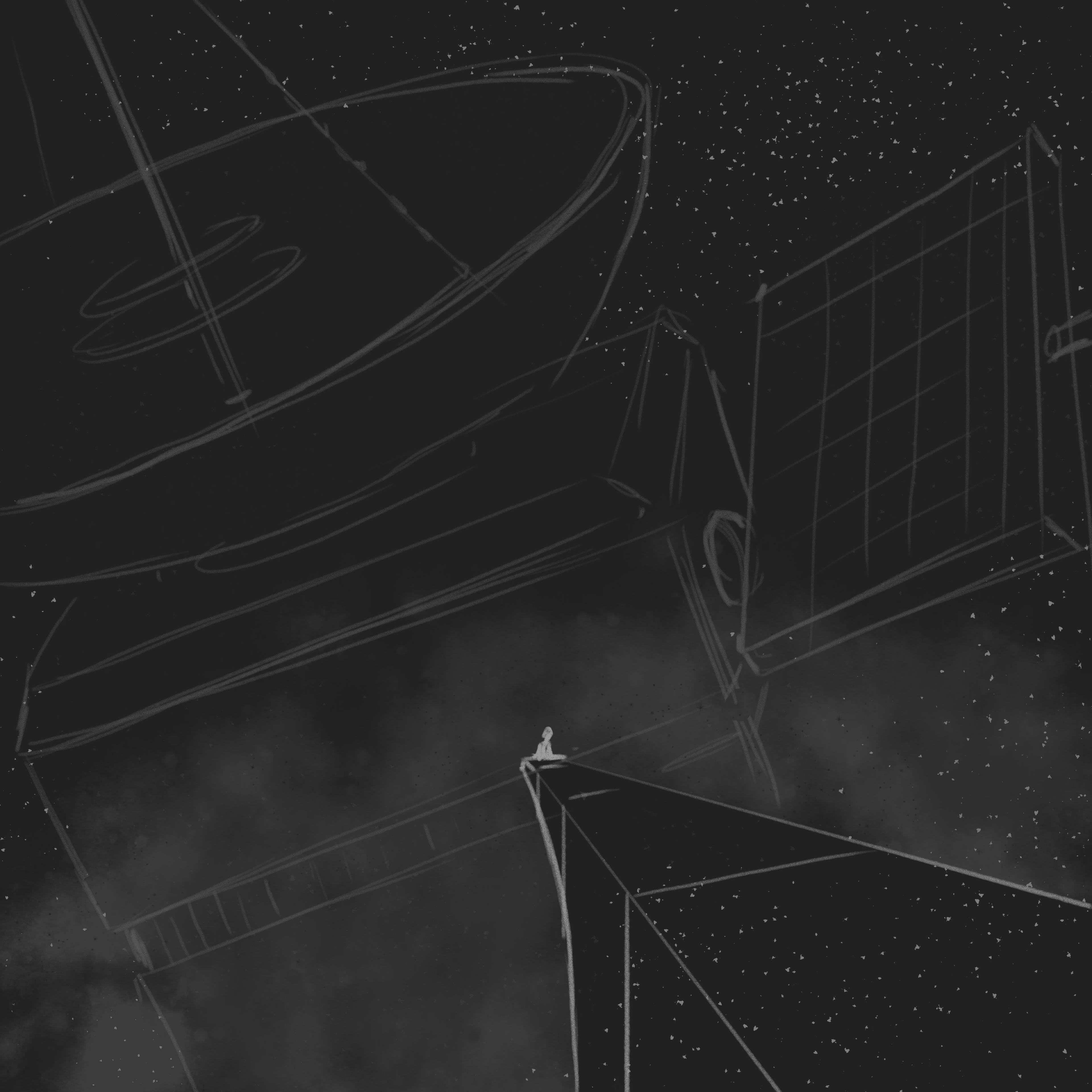
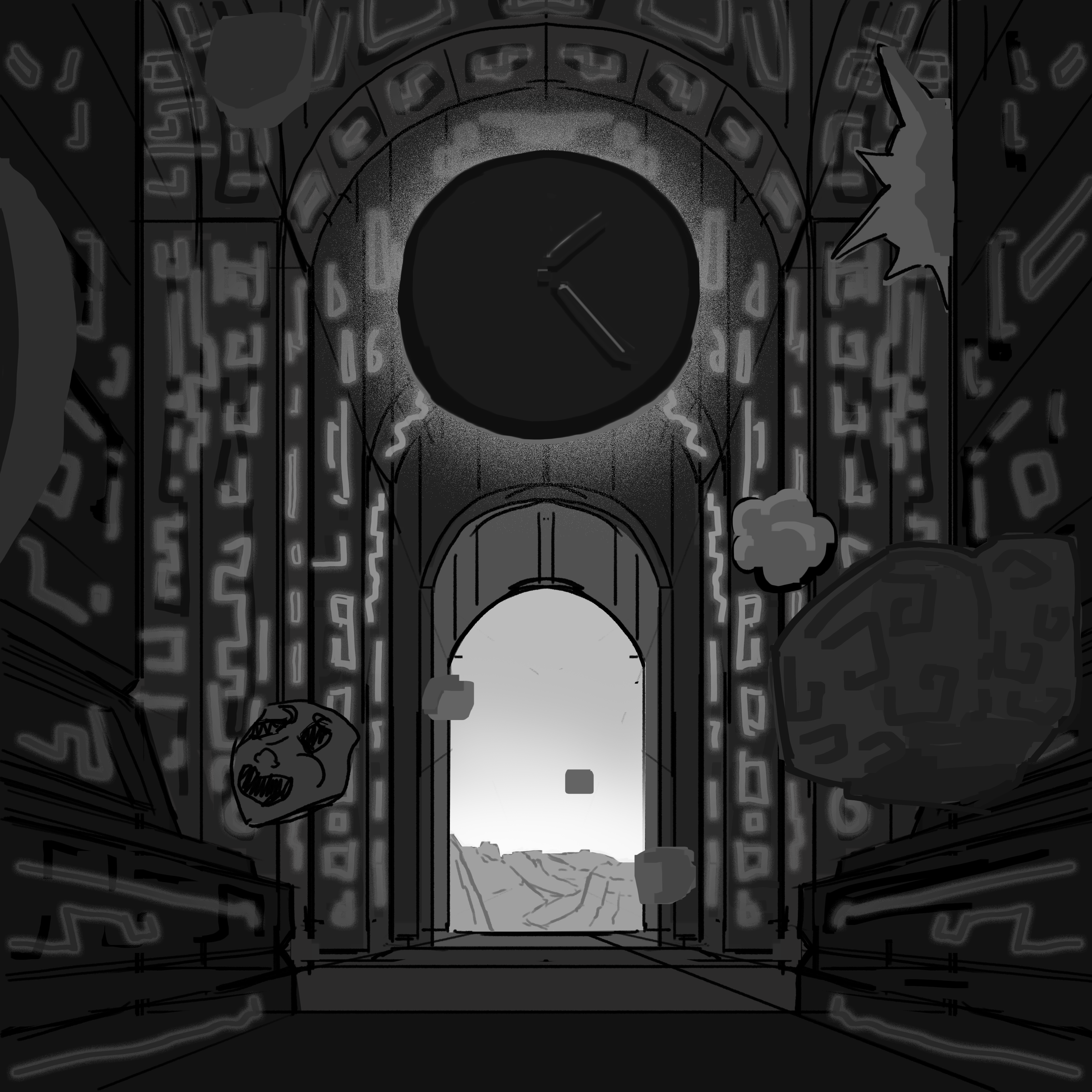
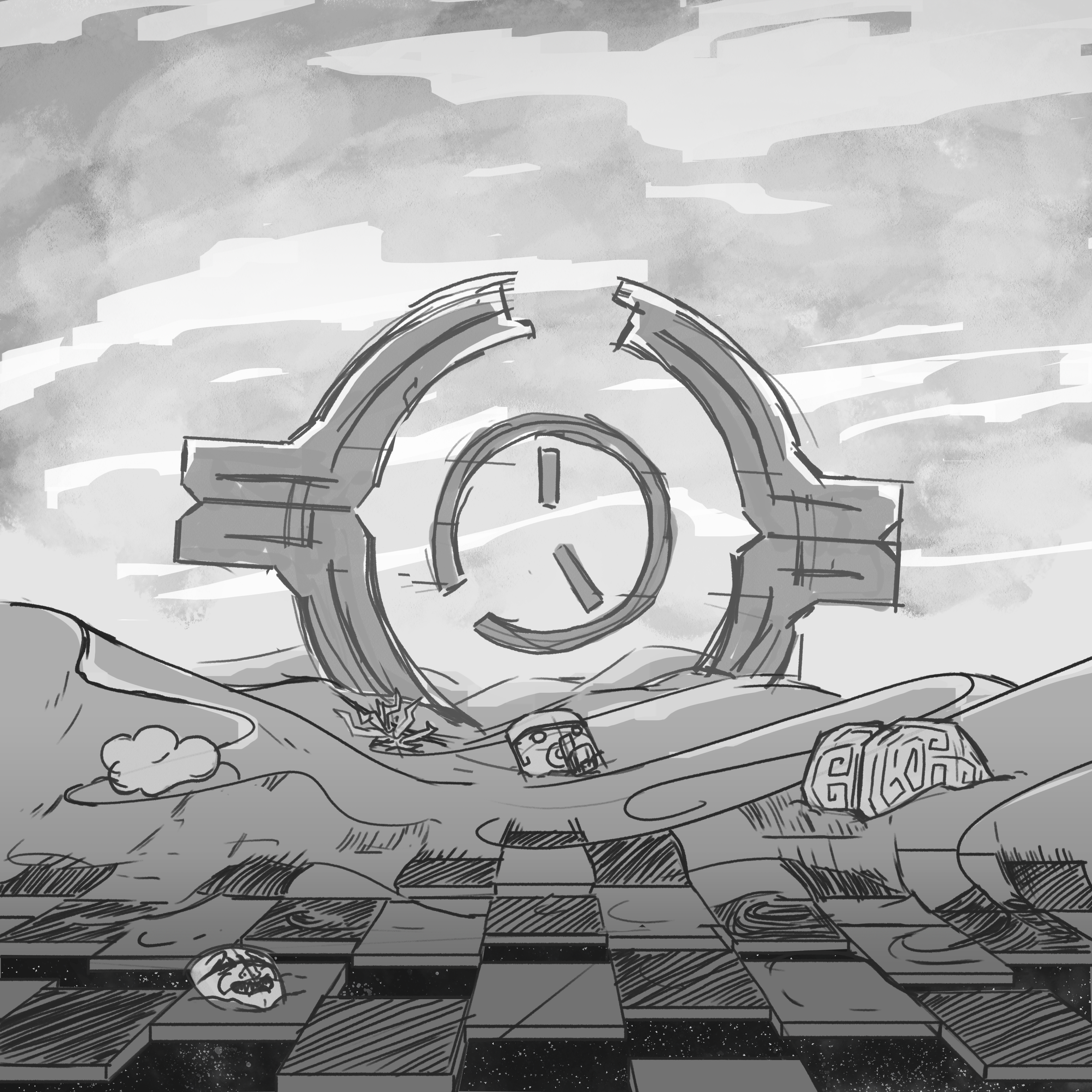
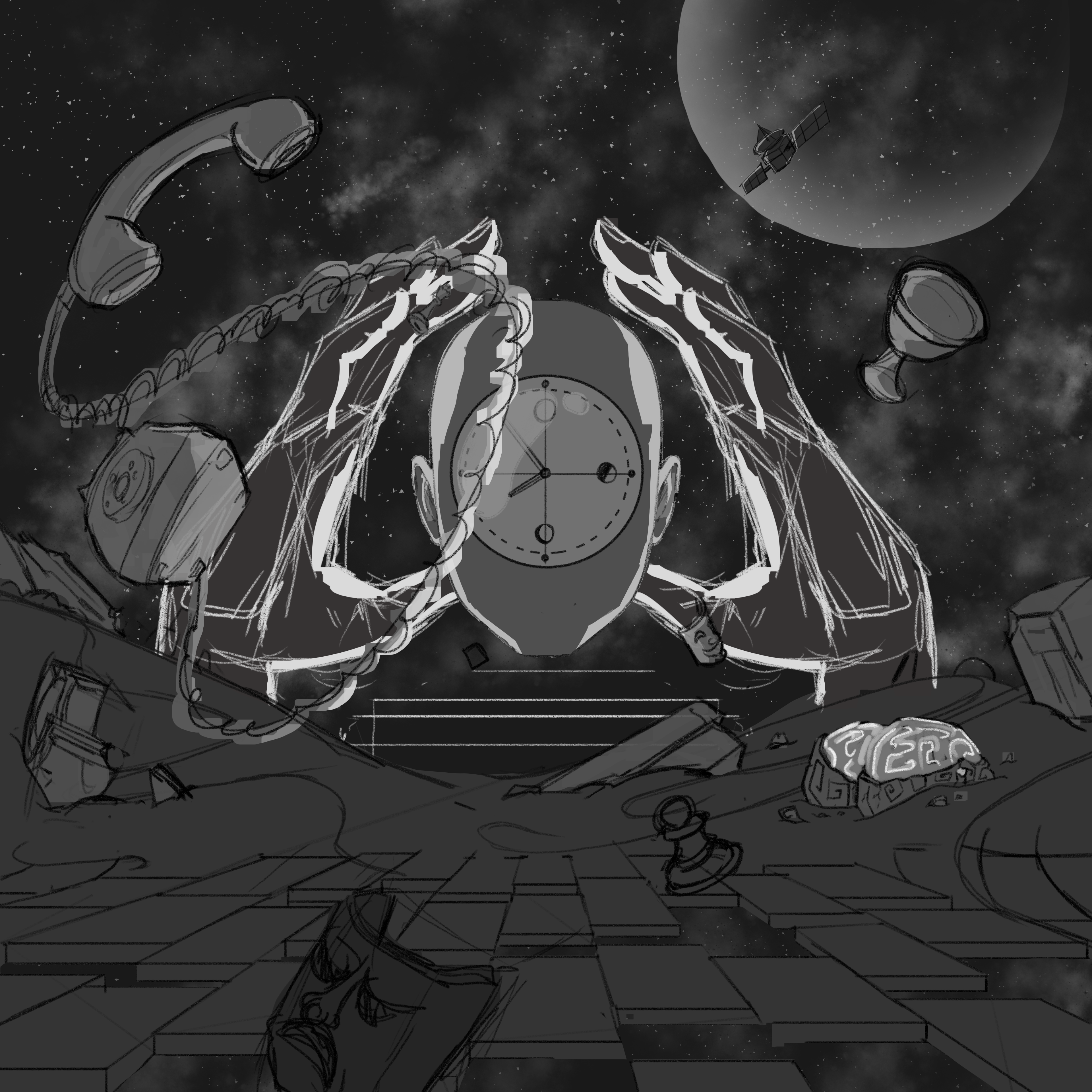
Early sketch explorations for the Single cover—testing out layouts, object ideas, and overall composition.
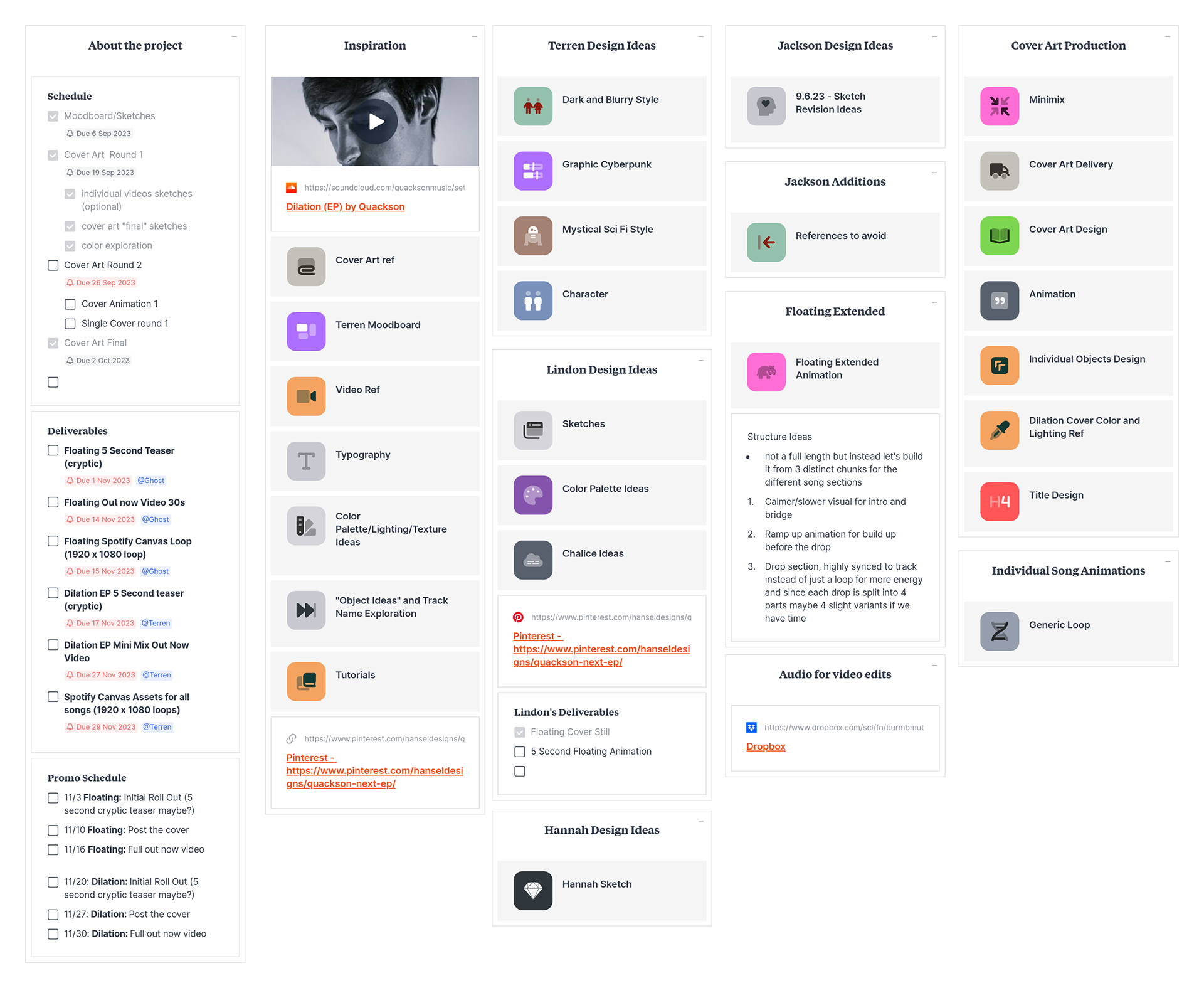
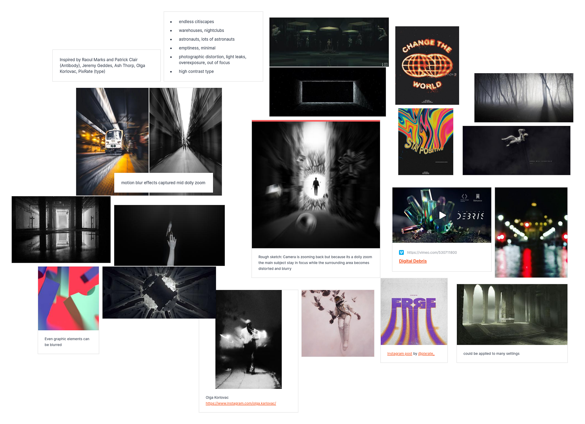
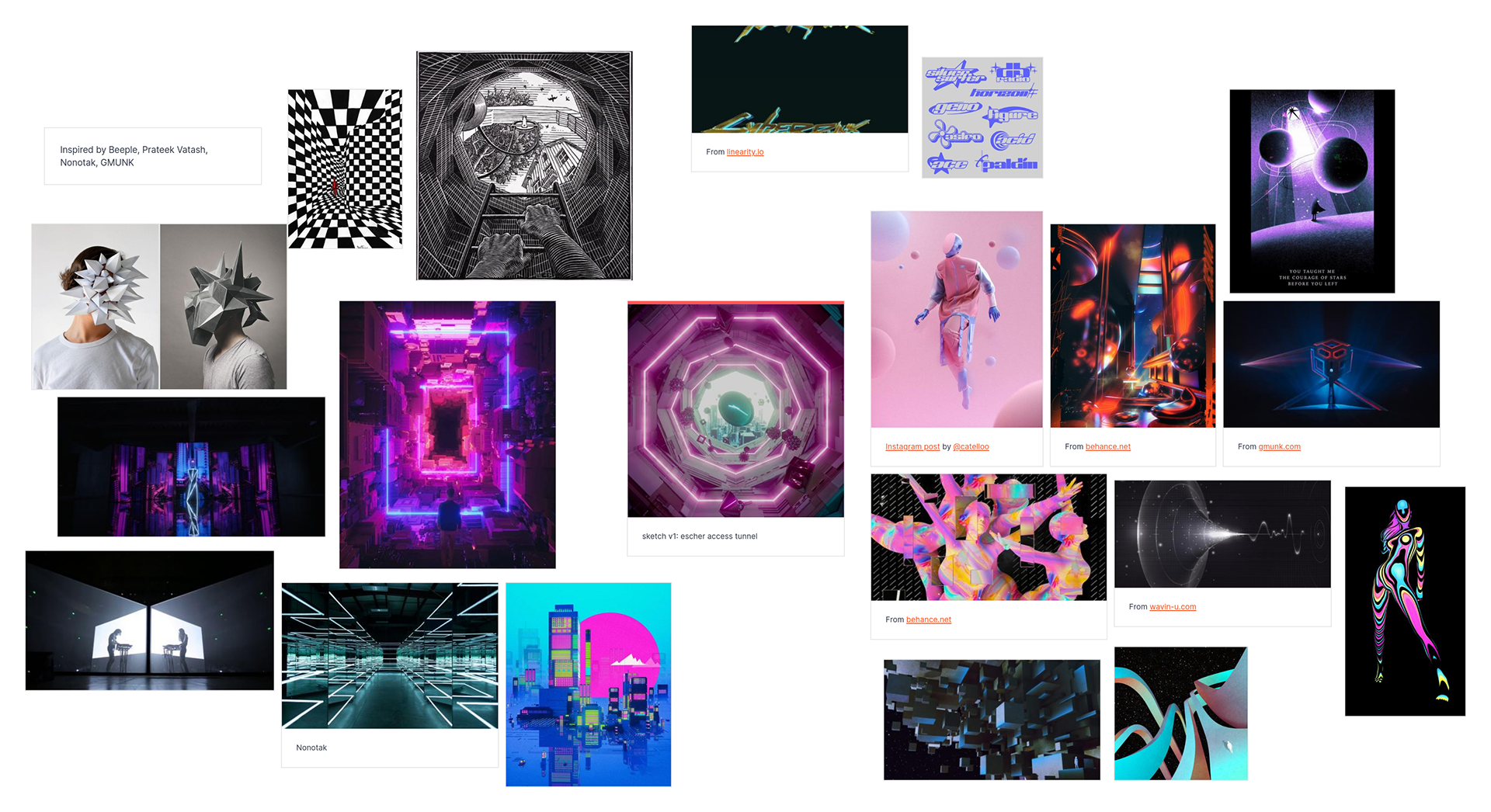
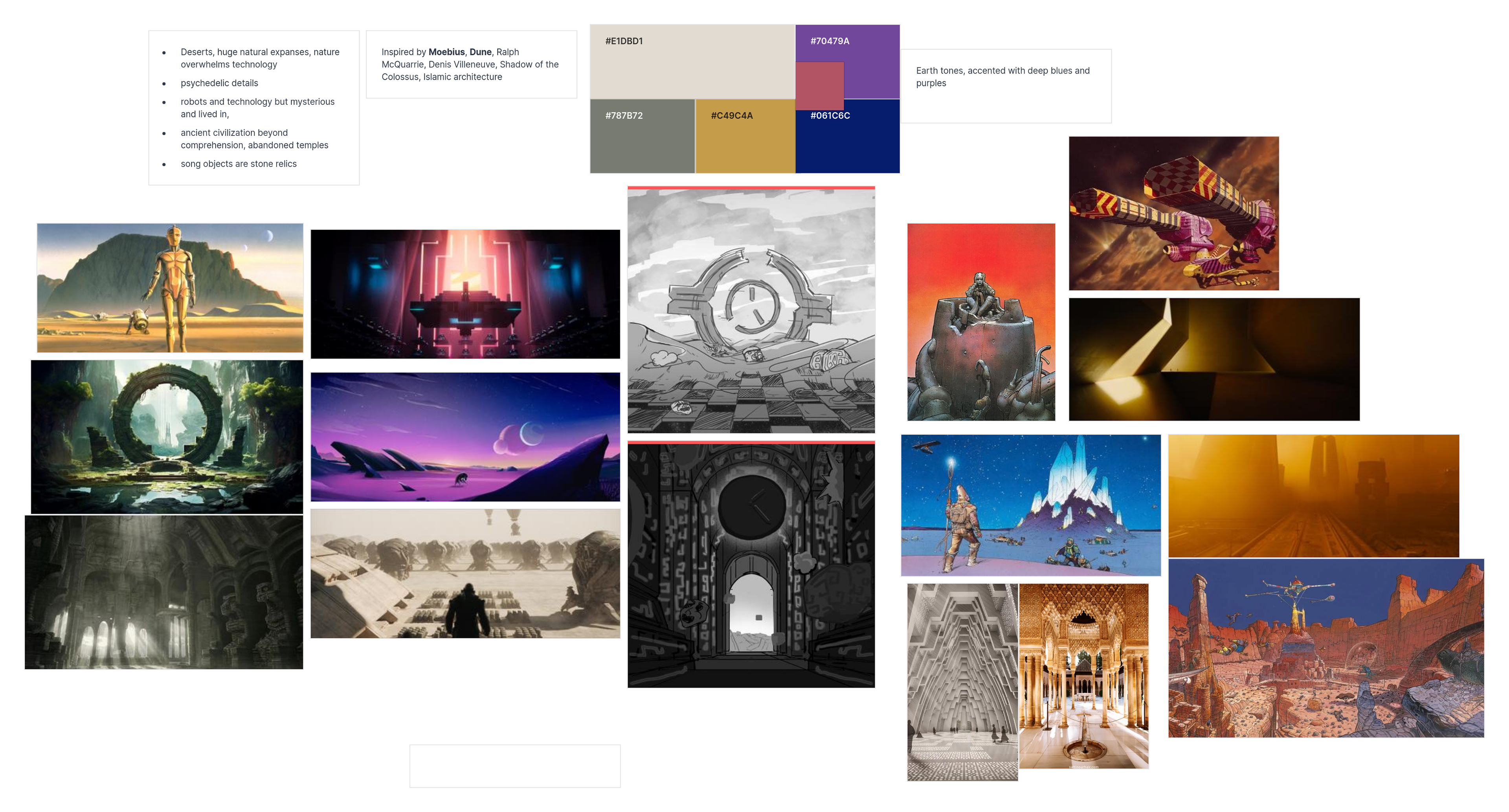
Milanote board used to manage the project—handling visual direction, animation planning, scheduling, and team communication.